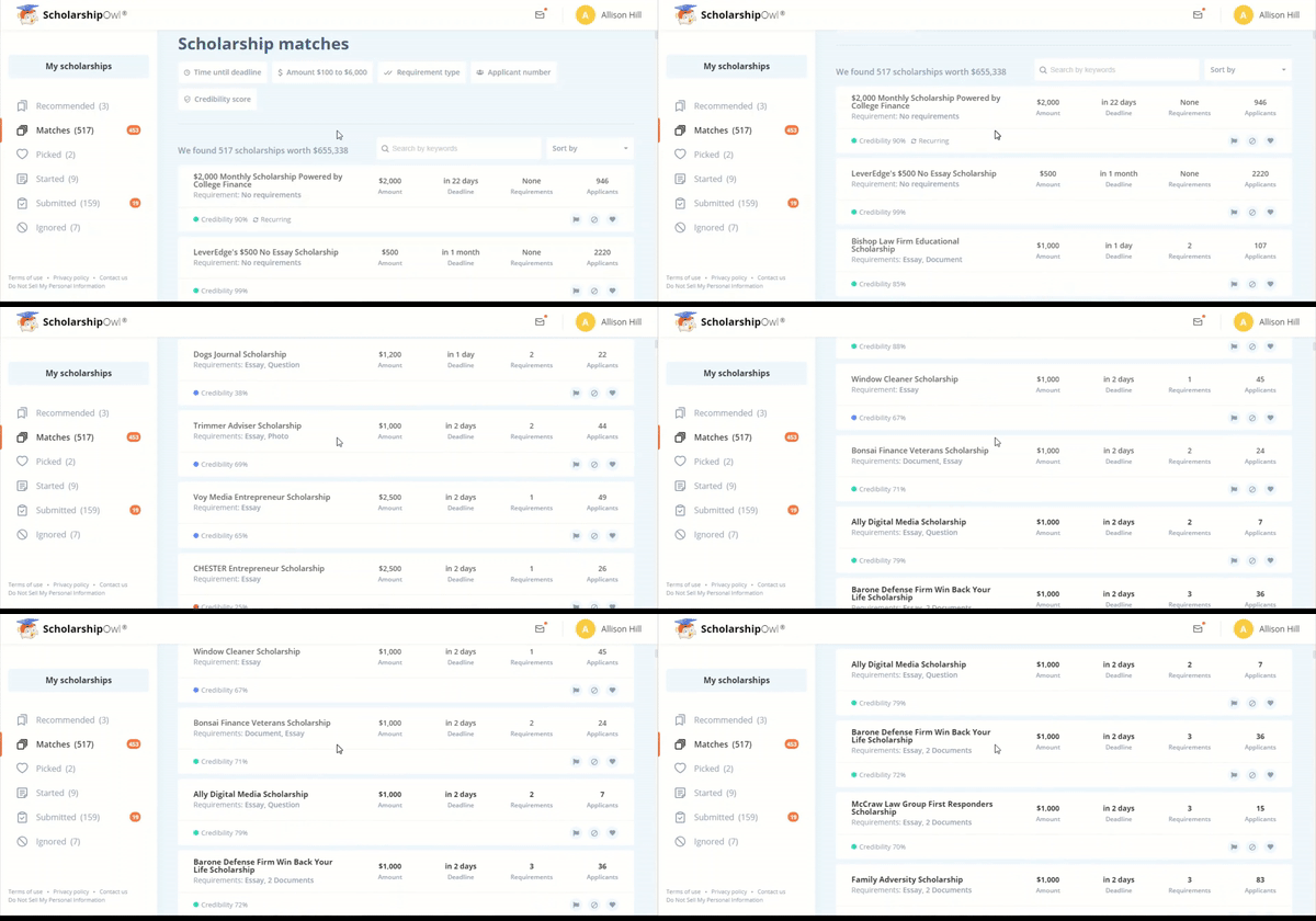
Well, it happened to us recently. We set off to fix a minor issue that we thought would make the process of selecting scholarships a little more comfortable for our students, and – how it usually happens in creative environments – one thing led to another, and: we ended up with a roaring beast of a platform instead.
This is the story and tribute to that small change.
Off to the Next Page – No More
One of the things that was always bugging our students, and us, with scholarship search results, was the pagination. You know, you get to the end of the screen after a seemingly random number of items, and then you have to click the number for the next page. The loading. The agony. And the non-existent “next page” button.
Was this the page I was at? 2 or 3? Maybe I should just go to the last page and move backward?
What if I skipped some really good opportunity?
Aside from these questions, there’s a bigger issue lurking between those page numbers. They might seem innocuous at first – the time lost and the pent-up frustration as you wait for the page(s) to load – but! let’s look at someone who really wishes to make good money via scholarships.
We always say scholarships are a numbers game – and they are. This means you have to search and apply for lots of scholarships to increase your chances of winning a significant amount of money.
So how does this mix in with the pagination? You can already guess – the number of clicks and time spent staring at the blank screen loading grow increasingly wild the more money you want to win.
And we don’t want that for our students. We want a smooth sailing experience. We want enjoyment, no pages included.
We wanted an infinite scroll.
Scroll, Scroll, Scroll Your Bot
The infinite scroll solves this problem.
With infinite scroll, there are no pages – just scrolling (duh) 🙂
Now you can comfortably look at your scholarships and immediately add favorites, select and unselect, without being bothered about the next or previous page.

Introducing this feature, we figured, solved a big drama issue. As the matter of fact, we tested it, and – yes – the loading was almost twice as fast (well, 98% if you want to be picky). That’s twice the time saved! Amazing! Just think how that translates into viewing hundreds of scholarships.
Win more scholarships with less effort
Simplify and focus your application process with the one-stop platform for vetted scholarships.
Check for scholarshipsAnd then we got thinking.
Where else can we improve speed?
Good Things Spread Easily
We know that a lot of students simply get overwhelmed with various scholarship applications, and ultimately slow down or completely give up on applying. It’s understandable and expected.
And also very solvable.
Turns out the infinite scroll, because of the implementation mechanism, affected several other features, and sped them up.
So, for example, when you search for scholarships now, the results will come back much faster, because of a different display algorithm.
Additionally, scholarship loading – i.e. opening scholarship cards – is much smoother and faster. By the way, have you seen our newest features on those? We revamped them to make applying easier.
And the whole dashboard became just a mean fast machine. How fast? Well, twice as much.
Small Steps Lead to Big Things
So there you have it – a state-of-the-art, unparalleled scholarship platform.
We can easily say it’s among the best scholarship platforms in the world, with loads of features to help you streamline the process and not waste time with technicalities.
And a fast one at that, too.
It all started with a simple scroll adjustment.
So maybe we should not underestimate small steps and what they can develop into.
And maybe you can already take one small step today towards winning your scholarship prize(s).
Head over to our website, and see for yourself how enjoyable the experience it is!


