Smooth flow and minimal distractions. Preferably without going back and forth all the time.
Are scholarship applications any different? Hardly.
Sure, we can grub and drag and feel exhausted afterwards. But should you?
ScholarshipOwl team recently did a major design overhaul of scholarships dashboard. The idea was to streamline scholarship applications even more and give students an even more enjoyable experience.
And by enjoyable, we mean – efficient, productive, being in the zone. You know, inspired and focused. Actually looking forward to doing something.
So how did we do that?
A+ by Design
When you open a scholarship card, the first thing you’ll notice is how cleaner and simpler scholarship details look. Don’t be fooled, though – simplicity is the mother of productivity.
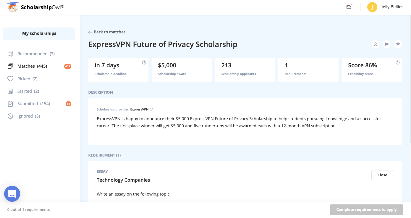
What do we mean by that? Within the scholarship details, everything is neatly organized into sections so you can easily access everything you need. The upper bar helps you evaluate scholarships and instantly decide if they’re worth the effort. Just below this bar, you will find a detailed scholarship description to help you in filling out requirements. And below the descriptions, we’ve added all the requirements that you can fill out directly from the scholarship details.
Wanna learn more? Let’s talk details and how to maximize these features.
All the Goodies and Then Some
The upper bar contains all the well-known favorites: scholarship deadline, the prize amount, current number of applicants, number of requirements, and the credibility score.
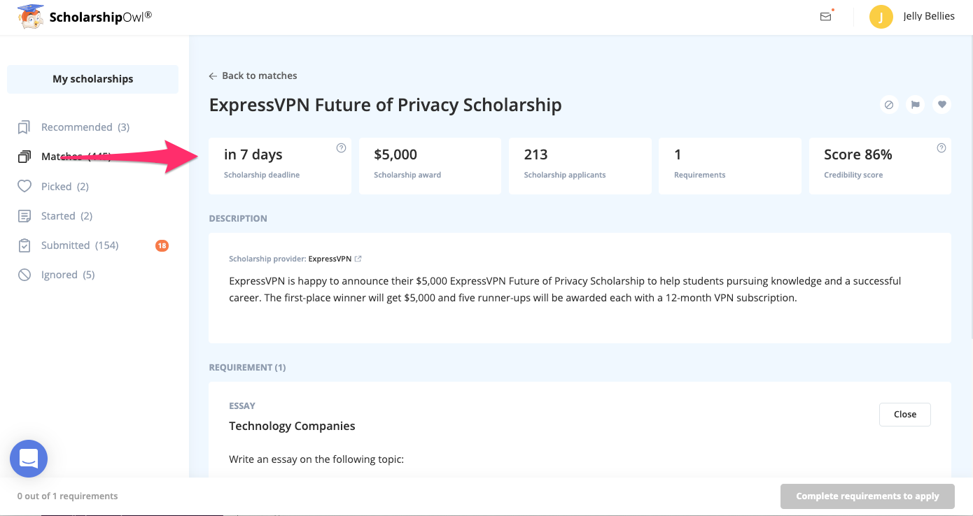
It allows you to evaluate the work you need to put in, at a glance, and decide whether it’s worth the effort. For example, the number of requirements tab is divided into obligatory and optional requirements, so think about whether you want and/or have the time to put in extra work and dazzle the assessors.
Win more scholarships with less effort
Simplify and focus your application process with the one-stop platform for vetted scholarships.
Check for scholarshipsThe credibility score lets you know how verified the scholarship is. We don’t recommend you go lower than 70% on this one.
And, finally, the number of current applicants hints at what your odds are – the lower the number, the higher the odds in your favor, and vice versa.
Simple, right? Look at the initial data and decide if you want to pursue the scholarship opportunity.
Done? Alright.
I Love You, I Love You Not
In the previous versions, students had to go back to the scholarship list in order to save a scholarship, ignore it, or even report it if they find an issue.
And even though this was great (you wouldn’t see the same scholarship for the hundredth time in a row), we realized that this back-and-forth was unnecessary. And it distracts students from doing the actual work.
So now you can immediately pick, unpick, report, or ignore and unignore a scholarship from within the scholarship details – via the upper right corner buttons. Simply click on one of the designated buttons to pick/unpick the scholarship, ignore/unignore it, or report it.
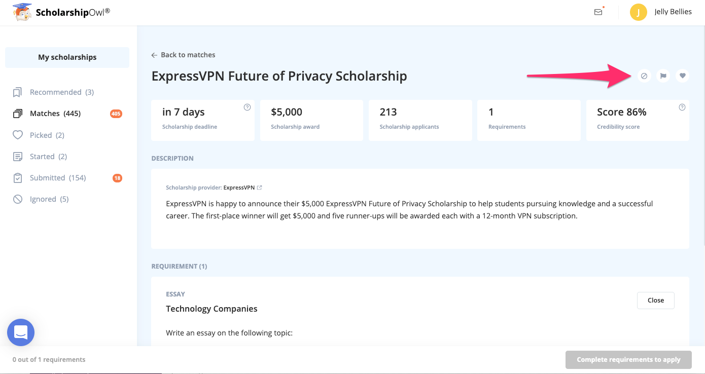
It makes the whole process a lot easier, and you a lot more focused.
The Meat of the Update
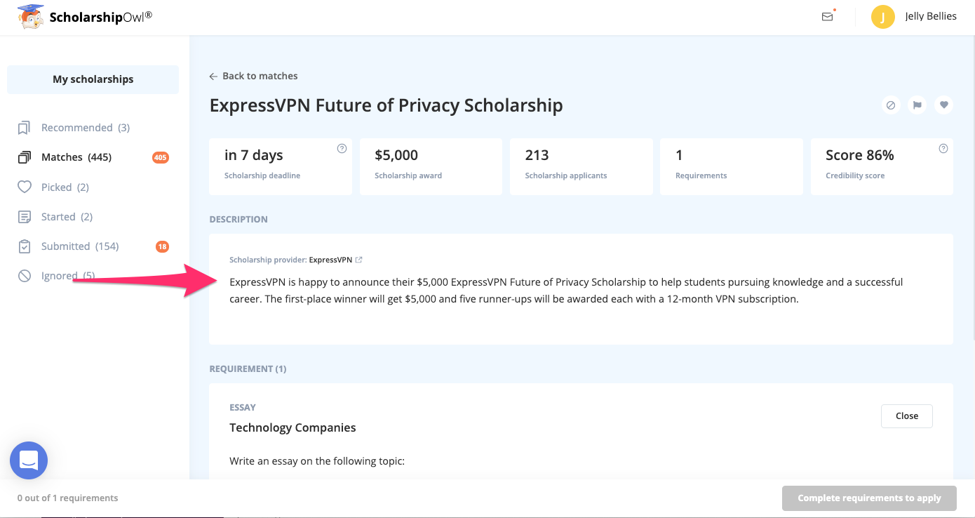
Just below the data bar, you will find a detailed description of the scholarship – with info such as who the provider is, what they’re about, and what their expectations are.
Why would anyone bother reading these descriptions? Isn’t it just about sending a nice polished resume and hoping for the best?
Well, no.
Remember, most scholarship providers are looking for students who align with their values. By having a description in front of yourself all the time, you can always check whether something you wrote or uploaded makes sense in the light of a provider’s expectations.
Which is a great thing, because…
All Requirements Under One Roof (And to Each Its Room)
We love good design. So we think it was always great that you could upload the requirements via the SOWL platform, but something was missing…
With the recent development of our own super cool editor, things started really falling into place. Or, rather, falling into their designated tabs within the card.
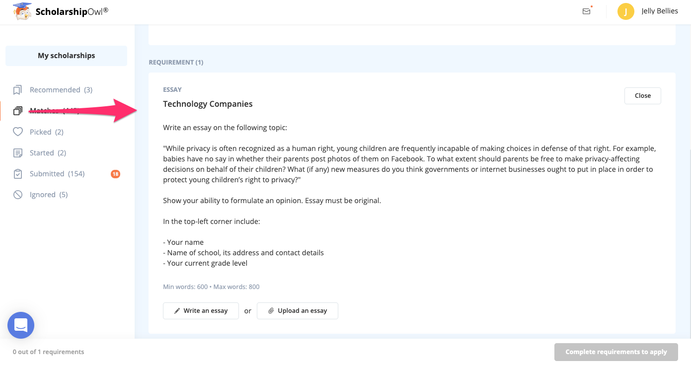
Now you can upload and/or write and send all the requirements from within our platform – and not just that – from within the scholarship details! Write an essay, upload a photo or a document, answer the questions – all in one place!
Additionally, the requirements are neatly organized into tabs that you can click and expand. You will see the obligatory requirements first, and then the optional ones.
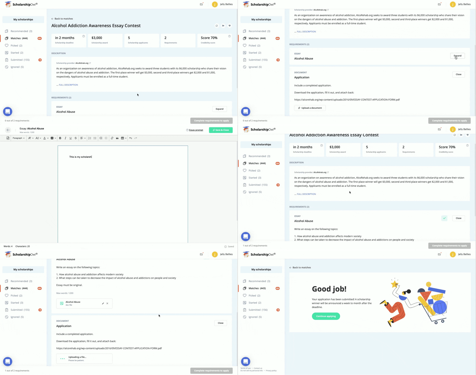
So, say, when you’re writing an essay, you’re not distracted by that photo you just uploaded. Or thinking about the next requirement when you still haven’t completed the current one.
It’s really all about the functionality and enabling you, the student, to gently focus on what you need to do.
In addition to all of this, there’s also a countdown timer that lets you know when the scholarship is ready.
Ready, Set, Go – and Enjoy!
This design overhaul was all about creating a calmer, distraction-free, tidy digital environment so you can focus only on applying.
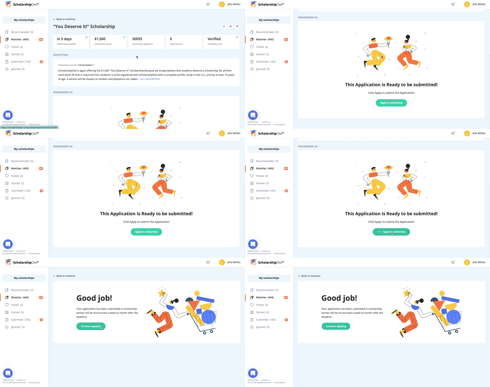
Clear design and neat overview of requirements, along with smart features we described will help you focus, and make your applications stellar.
Check out our brand new scholarship cards and tell us if your workflow is better.
If you want to learn how to write even better essays and maximize your chances for winning a scholarship, read our blog.
